Before You Build Anything, Test the Idea
I've watched smart people spend months — sometimes years — building something nobody asked for. Not because they were naive. Because validating an idea feels less productive than building it. There's no progress bar on a landing page. No commits, no deploys, no visible momentum. Just a page sitting there, waiting to tell you something you might not want to hear.
That discomfort is exactly why validation works. And a landing page is still one of the most honest ways I know to do it.
Why a landing page, specifically
The case isn't complicated. Building costs money, time, and the kind of emotional investment that makes it hard to change direction later. A landing page costs almost none of those things. You can put one together in a few days, point some traffic at it, and learn more in a week than you would in three months of development.
What you're really testing is whether real people, not friends or colleagues who want to be supportive, will do something when they see your idea. Click. Sign up. Pre-order. That gap between what people say they'd do and what they actually do is where most product ideas quietly fall apart. The landing page makes that gap visible before it costs you everything.
The feedback is also fast in a way that actually changes decisions. Not fast like "we'll review this next quarter," but fast like you can iterate the headline on Tuesday and see different results by Thursday. That speed matters more than most people think when you're still figuring out whether you have something real.
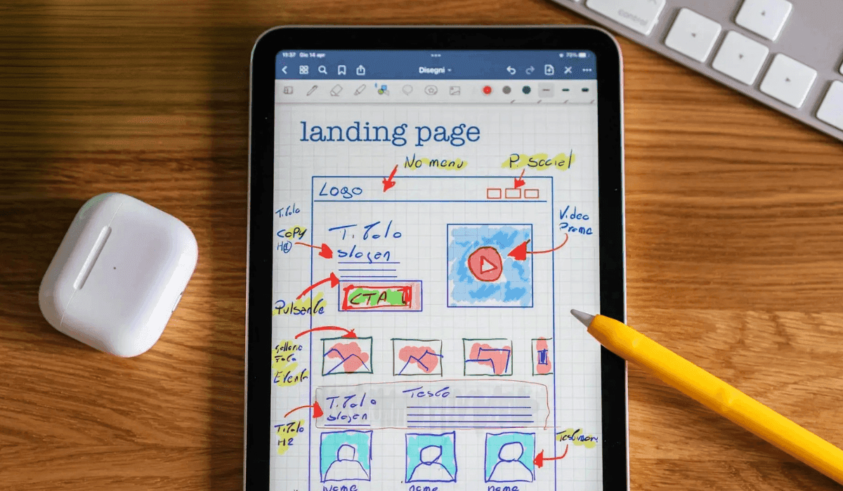
What the page needs to do
A validation landing page has one job: communicate the idea clearly enough that visitors can decide if it's for them. Everything else is secondary.
That starts with your value proposition. Not what the product does, but what changes for the person using it. Specific, concrete, written for someone who has never heard of you. If you can't say it in a sentence or two, the idea probably isn't sharp enough yet, and the page will tell you that.
Visuals help more than people expect. You don't need a finished product to show something; a mockup, a concept illustration, or even a well-chosen image can make an abstract idea feel real. The goal is to help the reader picture themselves on the other side of the problem, already using the thing you're describing.
The copy needs to earn its place. This isn't a product spec or a feature list. It's a short conversation with someone who has a real problem you think you can solve. Address the problem directly. Show that you understand it from the inside, not just the description. Then explain why your approach is different. If the copy could apply to five other products, it needs to be rewritten.
And the call to action matters more than most people give it credit for. "Sign Up" doesn't tell anyone what they're signing up for. "Get Early Access" or "Join the Waitlist" does the small but important work of telling the reader what happens next. Put it somewhere they'll see it early. Repeat it at the bottom. Don't make them search for it.
One more thing: if you have any social proof, use it. Early interest from real people, a small beta community, even a number that shows others are watching, all of it reduces the friction of being first. If you don't have it yet, scarcity works too. Limited beta spots, early-bird terms, anything that makes the decision feel time-sensitive without being manipulative about it.
The design questions
Keep it simple. A validation page doesn't need to be beautiful; it needs to be clear. One primary goal, one CTA, no sidebars or navigation leading people away before they've made a decision. Clutter is the enemy of conversion, and conversion is the only metric that tells you something true.
Make sure it works on a phone. That's not optional advice anymore; it's just the baseline.
And pay attention to visual hierarchy. Your value proposition and CTA should be the loudest things on the page. Everything else exists to support them, not compete with them.
How to read the results
Before you launch, decide what success looks like. Not in vague terms, but in numbers. What sign-up rate would give you confidence? What bounce rate would tell you something is broken?
A rough frame I use: a sign-up rate above 10% suggests real alignment between your idea and the audience you're reaching. Below 5% is a signal to look at your value proposition or your messaging before you draw any conclusions about the idea itself. These aren't rules, just anchors for thinking.
Bounce rate tells you something different. If people are leaving quickly without interacting, the problem is usually in the first few seconds of the page: the headline, the visual, or a mismatch between what brought them there and what they found. Time on page and scroll depth tell you whether people are actually reading or just bouncing off the top.
A/B testing is worth doing even at this early stage. Two versions of a headline, two different CTAs, two approaches to the opening image. The point isn't to optimize prematurely; it's to understand which framing of your idea resonates. That's information you'll use everywhere, not just on this page.
Keep the form short. Name and email. Maybe one question if it's genuinely useful for segmentation. Every extra field is a reason to stop, and you want as little friction between interest and conversion as possible.
Validation as a practice, not a step
The thing I keep coming back to is that this process doesn't end when you decide to build. It continues. You launch a version, you watch how people use it, you find out which parts of your story were right and which were wishful thinking. The landing page is just the first iteration of that loop.
CRISP, the framework I use for product discovery, is built around this idea: that clarity comes from testing assumptions early and often, not from planning until you're certain. The landing page is one of the clearest expressions of that. It forces you to articulate the idea, put it in front of real people, and let the data tell you what to do next.
That's not the comfortable path. Building feels better. But building the wrong thing, with real precision and real resources, is a much harder thing to recover from.
Test the idea first. Then build what the evidence points to.
Rafael J. Schwartz
Product leader. Writing about teams, clarity, and building things that matter.
Keep reading

Let’s talk
If something here resonated, if you're working through a product problem, or if you just want to think out loud — reach out!